If the recent dialog across social networks over the color of a dress says anything at all, it’s that color science matters. The display of color invokes numerous questions. Does everyone see the colors of a display in the same way? Is the display capable of presenting all of the colors necessary for realistic images? The first question is the subject of metamerics. The second question, which this article dives into, is the subject of color space.
The CIE color space, classified by year, describes the range of colors that can be perceived by the human eye in terms of electromagnetic waves. The actual color space is 3 dimensional, so it’s generally presented as a 2-dimensional multi-color slice for comprehensibility. The earliest such color space was published in 1931 (CIE 1931), but the depiction frequently used is CIE 1976, which gives a more accurate sense of visual sensitivity, and is the version used in the charts below.
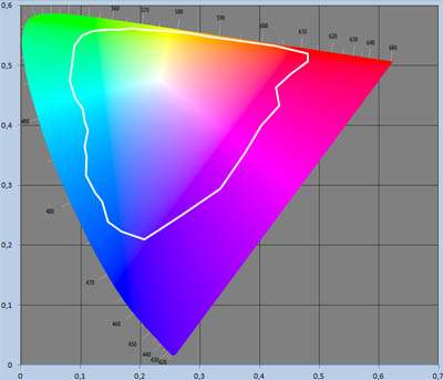
The range of colors to which we are sensitive, and the actual colors found in real life, are not the same. In 1980, Dr. M. R. Pointer published research in which 4089 color chips were used to determine the real surface colors one would actually come across in real life. Dr. Pointer did not consider his research to be exhaustive, but as empirical work, the gamut described served as a reasonable guide to the makers of display technologies. The Rec. 709 color space defined for HDTV largely lies within Pointer’s gamut, for example. Following Pointer’s work in 1980, other work has emerged that define larger swatches of practical color space. This includes the ISO 12640-3 reference gamut published in 2004, the result of finding examples of more colors.
The illustration below is of Pointer’s gamut, in a slice of CIE 1976 color space.
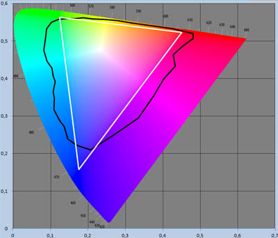
The question is how much color is useful to display? Film scientists studied this question long ago in the pursuit of precision color capture and presentation, and no one performed better at capturing color than Kodak. Television scientists, on the other hand, were happy with “good enough,” which didn’t earn them any points with the film community. When digital cinema was established, it was clear that Rec. 709 was not to be used. (Which is one reason why ordinary commercial HD projectors were not up to snuff.) Rec. 709 is shown below (in white) against Pointer’s gamut (in black).
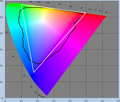
To better match film, the “DCI P3” color space emerged, shown below in white, along with Pointer’s gamut in black. P3 is considered a significant improvement on Rec. 709.
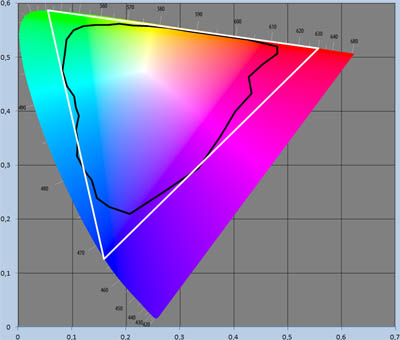
With the standardization of UHDTV, the television industry hopes to redeem itself with Rec. 2020, which defines a color space larger than P3 that encompasses Pointer’s gamut. The Rec. 2020 color space is ideally implemented with single-frequency primaries, which would require lasers. As this was intended for consumer products, quantum dot manufacturers are working hard to produce primaries that are almost narrow enough in bandwidth to display the full Rec. 2020 gamut. The illustration below depicts the Rec. 2020 gamut with Pointer’s gamut.
Naturally, next generation cinema will not allow itself to shadowed by television, and will also pursue Rec. 2020 or a similar color gamut (distributors willing with more DCP versions). But there are tradeoffs that should be recognized when attempting to produce laser-sharp primaries. Single frequency primaries will maximize metameric variability, where an audience of viewers will not necessarily perceive all colors as the same. (Think of the recent dress episode discussed over popular social networks.) Single frequency primaries will also maximize speckle, driven by the cancellations and additions that occur when single frequency light waves strike a surface and bounce. The problem may not readily manifest itself in consumer displays, as the makers of quantum dots are unable to achieve single frequency primaries. But the problem will easily manifest itself in next generation laser-illuminated projectors for cinema if single-frequency primaries are employed.
This problem interests the American Cinematographer Society (ASC) Laser Illumination Subcommittee. A subgroup was established last September, led by Pete Lude (RealD) and Dave Schnuelle (Dolby), to study the problem. The group’s attention is now directed towards projector manufacturers, who will be asked for their advice in the matter. After all, they are the only ones with equipment to study this, and the study needs practical guidance as much as theoretical. Questions likely to be asked include suggestions for “practical” primaries that would mitigate, rather than enhance, speckle and metameric variability. If such primaries exist (presumably comprised of several wavelengths of laser light), is there a noticeable difference between the color space defined by practical primaries and the ideal primaries of Rec. 2020? Or, for that matter, is there a noticeable improvement over P3? Pointer’s gamut aside, the question has been raised across the industry as to whether Rec. 2020 actually describes a color space offering a marketable improvement in image quality over P3?
As all of the laser-illuminated projector companies are represented in the committee, the RFI will be developed with their review. The Request for Information is targeted to be released before CinemaCon, however, it’s unlikely that results will not be available until after.
Credit given where credit is due. All charts in this report are taken from Kid Jansen and his online work The Pointer’s Gamut, a study well worth reading for those interested in learning more about color science.


